
Web Typography: Using The Golden Ratio and REM’s
Posted on | 6 minute read

When WordPress 3.5 beta 1 was released it came with, “Twenty Twelve”. While looking at style.css, I noticed the use of “REM” to set font sizes and margins. I had NO idea what REM was. In fact, I just started using EM’s in other child themes. Immediately, I turned to Google and started researching.
I thought REM was a band?
By definition, the REM unit is: “Equal to the computed value of ‘font-size’ on the root element. When specified on the ‘font-size’ property of the root element, the ‘rem’ units refer to the property’s initial value.“
tl;dr The REM is one of the newest font-size standards for CSS3. It stands for “Root EM”. You base your calculation on the default font size of the HTML element – NOT the parent-like EM. It’s basically “EM v2.0”.
So what?
The problem with Pixels is, they absolutely do-not-scale in Internet Explorer. Furthermore, with the onset of Responsive Web Design, having fonts that scale (in relation to the screen width) has become paramount. Percentages (%) and EMs are better, but they’re tricky and compound. Still not an answer. A real solution?
Use the REM
First, you need to set a default “root” font-size variable:
html {
    font-size: 62.5%
}
Why 62.5% instead of 100%? Simplicity.
Our default font is now 10px, which makes math easier. Now, 1.0rem = 10px. This becomes our $rembase.
Calculate other font sizes by dividing your desired size by the $rembase (in pixels). Let’s say, you want your <h1> tags to be 26px:
26 ÷ 10 = 2.6remor
32 ÷ 10 = 3.2rem
48 ÷ 10 = 4.8rem
and so on…Let’s take a look at a sample Stylesheet:
/* $rembase = 10px */

html {
    font-size: 62.5%;
}

body {
    font-family: 'Helvetica Neue', Arial, sans-serif;
    font-size: 1.0rem; /* 10 ÷ $rembase */
}

h1,
h2 {
    font-size: 2.6rem; /* 26 ÷ $rembase */
}

h3,
h4 {
    font-size: 1.8rem; /* 18 ÷ $rembase */
}
That looks simple enough, right? Just move the decimal. Now your fonts will scale perfectly during a browser re-size (if using responsive design), or if a user were to zoom in or out.
But what about Line Height?
Line heights have always given me headaches, that was until Chris Pearson released his Golden Ratio Typography Calculator. Now, figuring out line heights (among other settings) is a snap.
- Input your desired font size (16px)
- Specify how wide your content box is (mine is 740px)
- Click “Set my type!”
The Golden Ratio Typography Calculator spits out optimized typography values:
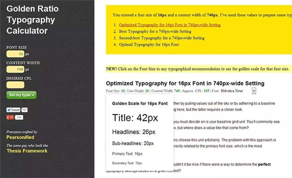
The calculator tells us our default line-height should be 26px. This variable is the $line-height-base.
We’re going to be using “Unitless line heights” as explained by Eric Meyer, so we can avoid unexpected results. What’s so awesome about the unitless line-height? You only have to specify it once in the <body> tag. Now, ALL other line-height(s) are relative to the parent font size. That’s too easy! (Of course, you can still specify your own to maintain complete control.)
To calculate, you divide the $line-height-base by the font size for that particular element (in pixels).
26 ÷ 16 = 1.625
How would that look in our sample style sheet?
/*
$fontbase = 16
$line-height-base = 26
*/

html {
    font-size: 62.5%;
}

body {
    font-family: "Helvetica Neue", Arial, sans-serif;
    font-size: 1.6rem;
    line-height: 1.625; /* $line-height-base ÷ $fontbase */
}

h1,
h2 {
    font-size: 2.6rem;
    line-height: 1; /* $line-height-base ÷ 26 */
}

h3,
h4 {
    font-size: 1.8rem;
    line-height: 1.444 /* $line-height-base ÷ 18 */
}
Note: We’ll only use three decimal places to the right since most browsers only calculate that far.
What about margins?
Yes, you can even use REM to set your margins. Margins, or “vertical spacing” is calculated using either 24px or 48px to maintain vertical rhythm. Let’s divide 24px by our $rembase:
24 ÷ 10 = 2.4remHere’s our sample stylesheet:
/*
$rembase = 10
$line-height-base = 26
*/

.some-div {
     margin: 2.4rem 0; /* 24 ÷ $rembase */
}

.another-div {
    padding: 4.8rem; /* 48 ÷ $rembase */
    margin-bottom: 2.4rem; /* 24 ÷ $rembase */
}
I’m convinced, now tell me about browser support.
At the time of writing: REMs are supported in Firefox, Chrome, Safari, Opera, and yes, even IE 9 & 10. It’s also supported in all mobile browsers except for Opera Mini.
Check out this list: http://caniuse.com/rem
What about fallbacks?
As is the case with most CSS3 wizardry, REM support in IE 6, 7, and 8 is lacking and will require a PX fallback. By declaring REMs after PXs in the CSS this example will degrade gracefully to the PX:
html {
    font-size: 62.5;
}

body {
    font-family: "Helvetica Neue", Arial, sans-serif;
    font-size: 16px;
    font-size: 1.6rem;
    line-height: 1.625;
}

h1,
h2 {
    font-size: 26px;
    font-size: 2.6rem;
}

h3,
h4 {
    font-size: 18px;
    font-size: 1.8rem;
    line-height: 1.444;
}

.some-div {
     margin: 24px 0;
     margin: 2.4rem 0;
}
The purpose of this post was not to stand on a soapbox and preach but educate you on the advantages of using REMs to enhance the typography on your site. Your comments are welcome below.
PX to REM Sass Mixin
// Create REM values with PX fall back
//
// Generate a REM with PX fallback from
// $baseFontSize. Enter the desired size based
// on pixels in numerical form. Supports shorthand.
//
// Forked from: http://codepen.io/thejameskyle/pen/JmBjc
//
// @author Greg Rickaby
// @since 1.0
//
// Usage: @include rem($property, $values);
// Example Usage:
//    @include rem(font-size, 16px);
//    @include rem(margin, 0 24px 0 12px);
//
// Outputs:
//    font-size: 16px;
//    font-size: 1.6rem;
//    margin: 0 24px 0 12px;
//    margin: 0 2.4rem 0 1.2rem;
// ----------------------------------
$baseFontSize: 10; // Based on HTML reset html { font-size: 62.5%; }

@function parseInt($n) {
  @return $n / ($n * 0 + 1);
}

@mixin rem($property, $values) {
	$px : ();
	$rem: ();

	$root: $baseFontSize;

	@each $value in $values {
		@if $value == 0 or $value == auto {
			$px : append($px , $value);
			$rem: append($rem, $value);
		}

		@else if type-of($value) == number {
			$unit: unit($value);
			$val: parseInt($value);

			@if $unit == "px" {
				$px : append($px,  $value);
				$rem: append($rem, ($val / $root + rem));
			}

			@if $unit == "rem" {
				$px : append($px,  ($val * $root + px));
				$rem: append($rem, $value);
			}
		}

		@else {
			$px : append($px,  $value);
			$rem: append($rem, $value);
		}
	}

	@if $px == $rem {
		#{$property}: $px;
	} @else {
		#{$property}: $px;
		#{$property}: $rem;
	}
}

@function rem($value) {
	$root: $baseFontSize;
	$val: parseInt($value);
	$return: ();

	@if unit($value) == "px" {
		$return: append($return, ($val / $root + rem));
	} @else {
		$return: append($return, ($val * $root + px));
	}

	@return $return;
}
Further reading
Comments
No comments yet.

riavon
Very helpful, thank you!

Nectafy (@nectafy)
Greg,
Thanks for spelling all of that out. Font sizes in responsive design have been problematic for me. This will help!

Lyfe
Thanks from the noob, Now that i can actually wrap my head around this.
Im going to do a total re-haul of my project site. Also thanks for pointing
me to the Golden Ratio Calculator.(plus links). Im Psyched and Ready.
THANKS

Chris Pearson
As a longtime fan of ems (and relational sizing in general), I am also quite interested in rems, which are, in my opinion, “ems done right.”
Over the past 18 months, I spent a lot of time testing different CSS approaches to see which I would use in Thesis 2 and associated Skins. Specifically, I was looking to see how I could transition from ems to rems, and that’s when I learned some unsettling stuff.
First, you mention Eric Meyer’s “unitless line heights” as a potentially simpler way of expressing line-heights. Because omitting units is simpler than including them, I was originally drawn to this technique as well.
However, upon testing, I became quite disappointed because I learned that browsers are extremely inconsistent with their handling of unitless line heights.
Though I don’t remember the precise results of my testing, I know that Chrome, Firefox, Safari, and IE all had different interpretations of unitless line heights. Chrome, my browser of choice, was extremely bad, oftentimes missing the resulting line height by a pixel or more.
For some people, one pixel off is no big deal. For me, it’s the difference between repeatable, predictable precision and an arbitrary crapshoot.
Given this information, I had to accept the fact that unitless line heights simply aren’t consistent enough to be included in a mass-distributed product like Thesis.
This was only a minor setback, though, because I really wanted to use rems or, in a worst-case scenario, ems (like I’ve done in my distributed products since 2006).
To make a long story short, my em/rem testing revealed more of the same browser inconsistencies. Again—and to my surprise—Chrome was the worst offender.
Here’s the precise situations where Chrome fails miserably:
If you are using rems or ems, and the *calculated line height* (that is, the numeric value the browser arrives at after multiplying your em/rem base by the line-height ratio) is less than the nearest integer, Chrome fails to round properly and instead truncates.
So, in a situation where the line height calculates to something like 21.999px, instead of correctly rounding that line height to 22px on screen, Chrome renders a 21px line height.
Fail.
The entire point of Golden Ratio Typography is to achieve a precise geometrical layout whose dimensions are informed by mathematical relationships.
If browsers cannot calculate the input maths properly, then this entire approach is undermined.
Through my own testing, I’ve determined that the only way to achieve precisely-calculated line-heights at this point in time is to use pixel values.
Browsers—mobile devices included—show almost no variance when pixels are the input basis. However, switch to unitless line-heights and/or ems/rems, and you’ll begin to notice all sorts of browser irregularities in your testing.
This is yet another area of web design/development where the specifications and possibilites far outpace the reality within which our products actually live.

Brent Norrisbrent
really nice breakdown of REM web typography. Special thanks for the graceful declination.

Miketee
Only problem I find, and I continuously battle with this, but your vertical rhythm has been thrown off by using the correct golden ratio of 26 for the line height. Because your margin bottoms are 24.
Miketee
Line-height: 24px; for the win, you you stay right in the baseline ( until you start using a border bottom it throws it off by a pixel :p )
Адаптивная web типографика + Compass Framework
[…] Web Typography: Using The Golden Ratio and REM’s Краткий курс — «Адаптивный сайт за неделю»: типографика и сетка (часть II) REM unit polyfill […]

ntimitree
Really helpful article

Josh Stauffer
Greg, thanks for this informative post on REM’s.
One note on the comment regarding vertical rhythm. I believe the 24px and 48px is dependent on your line-height. In your examples, you are using a line-height of 26px so I think the values should be 26px and 52px to maintain that rhythm.
Thanks again!